Book Design - Interviews
As a publisher of books about music, we are interested in how these two things, books and music, can work together. But the crucial third part of our equation is art. Visual designers play a massive role in Omnibus books. To learn a bit more about book design, we asked three of our regular designers a few questions about their work...
Amazing15
Martin Stiff and his colleagues at Amazing15Design run a design studio specialising in books and magazines. We asked Martin a bit about his process.
You can follow Amazing15 on Twitter at @amazing15design.
What is the process of designing a book cover?
At Amazing15 we’re lucky enough to be able to design covers for all manner of books. We work on fiction, non-fiction and licensed projects but whatever the book, whether science fiction novel or autobiography, when you’re designing a book cover you’re essentially trying to distill the entire story into a single image. To do that you really need a strong understanding of what the author is trying to convey. Sometimes that comes in the form of a detailed brief from the client and sometimes it comes from just reading the book! We’ll then look at other similar titles in the same sort of genre (especially if it’s a genre we’ve not worked in before) to get a handle on the sort of visual language we’ll need to employ; what sort of fonts we might use, colours, compositions and so forth. Sometimes we follow the market and other times we jettison the research and just do our own thing! While researching we let the project stew in our imagination so when we finally sit down to work we’ve got at least a couple of rough ideas in mind. This enables us to work on several different concepts simultaneously which we nudge along together. Some may not make it to a finish line and other ideas may spring up en route.
We work predominately in Photoshop and the limitless possibilities it allows can sometimes be a little over-whelming so often it’s a good idea to put your own parameters onto a cover. Sometimes the challenge is knowing where to stop!
For most covers we might hit the target after just one or two approaches, but some of the trickier books to nail have been known to take up to 50 rough concepts! Novels are particularly fiendish as each individual reader can take something different from the narrative so to find something broad enough to work for everyone without losing sight of the original vision is a tightrope. We liaise a lot with the editor and art director - and occasionally even the author - until we’re able to narrow down a direction from the rough ideas. After that it’s just a case of minor tweaks and then a final polish!
What are the creative challenges involved in illustrated books?
The challenges of illustrated books can be myriad. Depending on the subject the quality of the assets supplied to us can vary wildly. We’ve worked on art books for huge Hollywood movies and high profile video games (for example we designed the art books for the recent Dune movie and Guillermo del Toro’s new film Nightmare Alley) and the material supplied for those is often large, high resolution and stunningly beautiful.![]()
Our work on those books is really to present the art in the best way we can with as little distraction possible. But we’ve also worked on countless books where the material is from old archives, so assets are scans of old transparencies and the photography is blurry and low resolution, or sometimes it’s a scan of a scan and there you have to try and bring a lot of character to the page to hide the quality issues.
Our twenty years of experience in the field means we bring a lot of knowledge about which fonts will be easiest to read for the body text, for the captions and section headers and so on. Like with the covers, we try and make sure we use colours and general design furniture that’s in keeping with the subject material.
You have to ensure that an illustrated book isn’t overly busy because 200 pages of noisy design would be headache inducing but at the same time it needs to look interesting and every spread has to captivate the reader. Thinking of the project as a complete 200 page book can be a little overwhelming so it’s often simplest to break it down into smaller sections and put it together in a modular way. Because we approach the art books in this fashion it can sometimes come as a surprise when we see the final printed book! We worked on a visual history of Batman a year or so ago and it was 400 pages long. Digitally it was easily manageable but when we received our copies we were stunned how physically huge the final book was!
How far is it a collaborative process?
We love to collaborate with people - it’s the best part of the job, really. We relish the opportunity to hear other creative voices so whether it’s a single book cover or a huge art book getting feedback and thoughts from the team involved is invaluable. It can keep you on track and help make sure you don’t lose sight of the goalposts and it ensures it keeps your design work fresh and relevant.
Everyone comes to a project with their own preconceived ideas and notions about what they want from the final product and our task is really to process all that information and then to distill it all into a result everyone is happy with. It can be a tricky job to manage all those viewpoints but that’s part of the enjoyment!
Do you listen to music when designing? If so, what have you been listening to recently?
Oh we listen to loads of stuff in the office. We’re really enjoying Nick Cave and Warren Ellis’ Carnage album which came out during the lockdown, and the recently Bad Seeds B-Sides compilation is great too. We also love The National so they feature heavily in the studio and we’ve loved Lana Del Rey’s last few albums.
We’ve discovered Phoebe Bridgers work recently, too and the new album by Bleachers is a lot of fun. It all depends what sort of mood we’re in and what we’re designing, really. We go through phases of listening to different stuff. We listen to a lot of podcasts as well - true crime documentaries and comedy interviews are particular favourites but we also enjoy listening to audio dramas - horror especially!
Where do you draw inspiration from?
When we work on a licensed book - such as the Art and Making of The Stand or the Harry Potter Baking Book we did recently - there is often a visual identity already established with the subject so our job is to translate that into a book format.
As designers we're also fans of design in general so we’re always looking at books to see what other people have done. The trick is to sort of saturate yourself in the industry.
One small idea you may have noticed in a book ages ago will suddenly inspire something you’re working on currently and help it all click into place. The challenge is to keep your ideas fresh and relevant so it’s important to know your market.
What are you working on?
I’m pleased to say that in the ten years Amazing15 has been running we’ve remained insanely busy throughout. Most of our projects come with scary NDAs so I can’t really discuss a lot of them, however we’ve just finished a huge book about the art of film director James Cameron, an enormous branding project for the BBC, a book about the making of the TV show Inside No. 9 and an illustrated biography of Kevin Smith.
We’re working on several new film, TV and video game projects and we’re continuing with the design on a series of graphic novels for DC and Hachette.
For the lovely folks at Omnibus we recently finished The Best of Jamming! (which is available now!) and we’re currently working on Glam!, an illustrated book detailing the history of Glam Rock.
Raissa Pardini
Raissa Pardini is a multi-disciplinary artist and designer who has worked on many Omnibus projects including The Velvet Mafia, Steve Lamacq's Going Deaf for a Living and Pamela des barres' I'm With the Band. She is currently working on Duke Fakir's autobiography.
She can be found on Instagram at @raissa_pardini or via her website.
What is involved in designing a book?
Working as a book designer involves so many little things. Eyes are on type, colours, photography and, more importantly, trying to create a balance between space and full design. That’s the real trick! Readability is always crucial with any project I work on.
What’s a key part of your creative process?
Digging into the story behind the book is a massive part of the design process. Getting to know the era we are talking about and the trends of that decade is fascinating and really important. Along with that I learn about the message we want to send with the project, often through collaborating with other people involved. I also aim to understand the people who will enjoy the book... It's like a little Tetris game!
What are you working on right now?
A book for Omnibus Press : ) I am also working on something for WeTransfer as well as some design for Måneskin, the winners of Eurovision 2021.
Lora Findlay
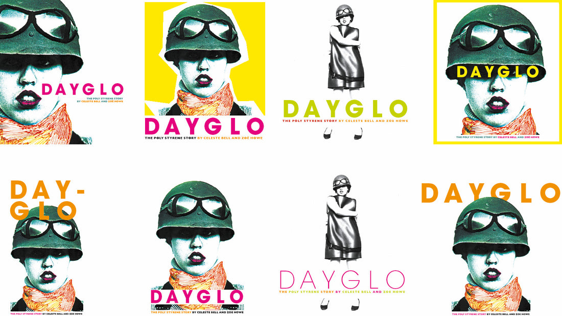
Lora Findlay is another regular designer with Omnibus Press. Her projects include Dayglo: The Poly Styrene Story, The Lyrics of Syd Barrett and My Generation: The Classic Rock Photos of Baron Wolman.
For more information, visit Lora's website: https://www.lorafindlay.com/
I have been designing books for Omnibus Press for over 15 years now. It's a dream job for me as I owned several of Omnibus books as a teenager, including 1988: the New Wave Punk Explosion by Caroline Coon, which I loved. My well-thumbed copy is still on my bookshelves. I trained as a graphic designer in the 90s and cut my teeth as an editorial designer on music magazines such as Mojo, Q and Kerrang. I moved into books a few years later and realised that I loved working on bigger projects with long lead times.
I have worked on a variety of subject matters for Omnibus, from Paul Slattery's photographs of The Smiths (my first project) to Syd Barrett's lyrics. Each book requires its own aesthetic. The first stage in the design process usually involves talking to the editor and gaining an overall view of the main aim of the author. Then I will usually take a close look at the graphic presentation of the artist featured - sleeves, posters, flyers and the general look and style. I need to take into account factors such as the size of the page, the number of words per page, the images available etc. I will usually supply dummy pages to the editor at this stage for approval. Once this is agreed, I can begin designing the book.
With a large photo book such as Looking Through You or in-depth book like Dayglo, I will work on a picture edit which can take several weeks. I will order the images chronologically in order to work out where to place them in the book and I will also check the quality of the pictures at this stage - some may need touching up in Photoshop or rescanning. Once I have the pictures in chronological order, I can begin the layouts. I try to be conscious of the 'rhythm' of the book - making sure there is enough variety in shape and size as I go through the pages, contrasting a quiet photograph with a lively scene, a famous image with an unseen shot and so on. Sometimes there will be a series of pictures which run quite small on the page, at other times there will be a double-page spread featuring just one photo. It's important to let the images 'breathe' - there needs to be enough space around them. If the page is too cluttered, the impact of the picture will be lost. If there is written text throughout the book (as there is in Dayglo), I have to be careful to place the pictures near the appropriate copy. Dayglo was such a fun project as it included Poly Styrene's DIY graphics which I really loved, as well as many stunning photographs. Once I've completed a rough layout of the book, I will return the first proof to the editor who will get back to me with changes and amendments - this can be quite a lengthy process!
My favourite part of the design is the cover as obviously this is the first thing the reader sees. It needs to have a strong visual impact and entice the reader to pick up the book. I will usually come up with several alternatives for the cover which I'll pass to the editor. The author always has an input in the cover and so do the sales team. With the Dayglo cover, for example, we were pretty certain of the cover image - a photograph which had been hand-coloured by Poly Styrene herself - so it was a matter of selecting the right colours and type to go with it. I'm including some alternative options here but I think final cover was everyone's first choice. 
I listen to music constantly while I work. I will always play the artist's music but I'll also often return to my favourite 80s and 90s albums. I listen to the Cocteau Twins and Sigur Ros frequently whilst I work as I find them soothing - there's a lot of space in the music which allows me to design without getting distracted.
Thank you to all three wonderful designers for sharing their process with us. You can find a Spotify playlist with the featured music here.